My Blog List

Wednesday, September 29, 2010

Quotes

1. "Say you'll never let me go." 2. "Get enough of the world." 3. "Tell me what you feel." 4. "You tell me to live." 5. "There's beauty in break down." 6. "These wounds won't seem to heal." 7. "How do rumors get started?" 8. "I can't take my eyes off of you." 9. "We will walk this road together." 10. "Let's take off in the blue." 11. "It's the eye that takes the picture."

Monday, September 27, 2010

Final Critique of Text as Texture

My critique group told me that my my background harmonized with the dots. They said that it was a good choice to keep it from contrasting. The newspaper flows and adds continuance to the piece. The liked how I made the newspaper darker in the middle, and lighter as it extends outwards. The different elevations work well. They said that the black newspaper around my cirlces works good because it adds to the 3D effect. They noticed that the first dot in the middle has newspaper running in a different direction than the others. They didn't like this, but I do because it marks the beginning of the swirl. The newspaper isn't closing around my circles enough. There is some white space in some text, but the radiating of the cut lines on the outside is good.

They told me that my accordion book has a good variety of circle ideas. The craftsmanship is good. They said that any one of them could be their own piece if they were hung on the wall. If I would have chosen the star template then it would have been too contrasting.


Sunday, September 26, 2010

Human Compositions

This project was really fun! :)


2D Project Part 4: Text as Texture

This is my final piece. When I got critiqued I was told that it was nice and the negative space is really helping it.
The process I used to make this texture was just cutting out a whole bunch of triangular pieces of newspaper. I started it out with the darker, smaller pieces in the middle, then the medium sized ones, and then the larger pieces got lighter on the outside. The two darker shades of text look neater because I was able to cut them out on the same page with the same paragraphs and glue them together. The outside pieces don't look as neat because I had to cut them out on different pages and there is a lot of open space between the text. I used foam sheets for my circles. I just cut out different sized circles, glued them together, and the wrapped the darkest newspaper I could find around them to make them look neater and blend into my piece better. I spaced them out a little more because I didn't want to make the space seem too tight. When I made my eight sample textures, the one that had the swirl like this one reminded me of those round staircases. This is why I made the circles different heights; to make them seem like stairs. 
Overall, I had a great experience making this.  I never thought I would use as much newspaper as I did on this project.


2D Project Part 4: Text as Texture


Thursday, September 23, 2010

Human Compostition Brain Storming

For part four of our project we are working on human compositions. We have to come up with one solution to use for all of our groups' compositions.  My group has chosen to use our square sketches, so we have to come up with ways that we can be the squares, or what type of method we can use on every single sketch. 

Team Members:
-Bryttani, Paige, Carlee, Rachel, and P.J.

White Space:
-Use furniture covers
-Cover ourselves with flour
-Cover ourselves with powered sugar and use chocolate icing for black space
-Bright street light at night
-Put white tape on outside of phones
-White jeans with a black square pocket
-White building and use windows as black
-Paint fingers white with paint or finger nail polish
-Black top tables with a white floor and shoot from above
-White screen and we will be pixels on the screen

Composition:
-Wear boxes for the squares
-Use our fingers
-Face squares with square objects
-Body squares
-Use the paper bag grocery bags over our heads
-Gravestones
-Traffic signs
-Side of a builing with windows
-Square cakes or cupcakes
-Cut out square shapes and hold where ever we need them

Sunday, September 19, 2010

Final Cardboard Project

This is my final cardboard project! It is a sweetgum.
I was told that it came out nice, but the top of the sphere just needed a little work.  My group said that they wish I could have put a little more of the pointy things on there and it would have made it look fuller.


Text as Texture

These are the eight text as texture pieces that I have made. My favorites are the ones that swirl around.


September 15 Lecture/Reading Summary

Post modernism is pluralism of viewpoints and shift from a dialog taking place in person to a mediated dialog through art fairs, media, etc.

Modernism is the shock of the new rapid progression of styles transgressive-opposition to mainstream society. Avant Garde was a transgressive and he had a rejection of the past. He had a colonial view of non-european culture. The Great Eastern ship that was being built in 1850 represents modernism as well. In 1826 the first surviving photograph was taken, and in 1889 the Eiffel Tower was being built because it was the 100th anniversary of the French Revolution. Photography made records of the world available to the public. They could now see who the president was or what certain buildings looked like.

Impressionism can be represented by Monet. Critics didn't like his work in the 1870s because his paintings were just impressions of real life. He emphasized color because that was the one thing photography couldn't do.
 Photography gave painters the idea to draw pictures of the real world, people, and everyday life.

Post Impressionism consists of inventing new art. Fernand and Van Gogh wanted to invent new art and  Fauves made new art by using cubism.

Italy: Futurism
Russia: Constructivism (white on white, 1905-1914)
Germany: Expressionism
Holland: De Stijl

September 10 Lecture Summary on Creativity

Creativity
The following words represent creativity:
-playful
-sensitive
-productivity
-originality
-flexibility
-organized
-analyze
-fluency
-maladjusted
-adaptable
-process
-observe
-mentally sensitive
-intellect
-emotionally sensitive
-physically sensitive
-auditory
-tastes
-visual
-balance/space/smell
-empathetic
-perception
-conflict/tension

--Organized creativity could be accidents and can help you see beyond.
--Fluent creativity is like a language. It's verbal, body, visual, written, math, science, music, sound, and tactile domain

--Productive creativity is an actual attempt and the artist puts his whole self into it.
--Originality is usually curiosity.
--Art can be mechanical. Without craft, creativity will escape.
--Blocks keep you from being creative. Everyone has blocks in their everyday life. Some examples of blocks  are facebook, television, reading, music, drinking, eating, shopping, sleeping, and playing video games.

Blocks are environmental, expressive, and physical. They are cultural and you can be faced with taboos (rules about where art should be, playfulness is for children, conformity is good, fear, etc.). Blocks can be also be emotional and intellectual because you see what you are supposed to see.


September 3 Lecture/Reading Summary

What is art?
-Something the artist thought of
- Image of a person
- The artist made it
- Expresses emotion
- Usefulness

The Impulse for Art:
People have been drawing on walls for 15,000 years. Art can be an expression of society or an individual. It can also be an expression of societal values. Pyramids and highways both represent societal values. They are organized and confined in some way and look like art.

To Present or Re-present?
When one thing stands in for another is representation. The different styles of representation are:
-Naturalistic- as in nature
-Realistic- true to life
-Stylized- simplified to emphasize important details
-Abstract- highly stylized (may not be recognizable)
Non-representational art is abstract art.

Scale of Representation:
Wax figures would be considered hardcore naturalism or realistic. Baits' art falls into styliztion, and picasso's art leans more towards abstract.

The Exquisite Corpse Two

The bored sunny swam he the beautiful.

This weekend I went for a walk and went to my grandpa's lake. I wanted to get a picture of a turtle in the water because I always see turtles there, but there weren't any. Then some ducks came swimming towards me out of nowhere (it scared me, I'm not gonna lie) and I thought it would be a good idea to take a picture of one in the water with the sun reflecting on the water. The ducks really helped me out, and I didn't notice anything blocking me.

Tuesday, September 14, 2010

Playful/Periodic Critique Part 2

On Monday, September 13, we had another group critique. We were given a guide as to which questions we should ask and what we should look for in the person's work. My group went to each person's sketches and told them what they should improve and what is working really well in the pieces.

My group told me that my playful and periodic sketches were both communicated successfully and they would be able to tell which one was which if they were separated.

Improvements:
I need to fix the edges on some of the compositions, color in the shapes better, and use better paper to work on so the glue will stick better. These are some details I noticed myself that I chose to fix.
My group told me that in the playful piece, one of the squares looked a bit rectangular. They noticed closure and continuance in both and said that my continuance piece looks similar to my playful one because of they way the squares and circles are positioned and the way they flow. They suggested I bring the squares in the periodic piece a little lower or higher to create a better effect. The sketches they chose for me to use for Part 3 were my continuance and playful sketches.

Sunday, September 12, 2010

Square (Form Interrelationships) Final Two

These are the two sketches I have chosen for Part 2 of the project. It was a very tough choice for me, but I have finally decided.

Here they are..


Playful
Periodic

The Exquisite Corpse

On Friday, September 10, we had to write an adjective on our own piece of paper and then pass it around the group. Each time is was passed the person who got it had to write a verb, noun, or adjective. After the sentence was complete, we were told to shoot a series of images that represent the sentence. My sentence didn't really go together so I changed it up. It read at first: "The bored sunny swam he the beautiful."

Let's see if mine makes sense. 

The beautiful, bored sun swam.

Thursday, September 9, 2010

2D Project Part 2

The second part of the project involves using squares to form interrelationships. They should either be playful or periodic. In class we had to come up with 14 thumbnail sketches for both terms and then choose the eight we thought were best; four for each term.
This time around it was a little harder deciding which sketches represented the terms the best. We didn't get to get in our groups to critique them so I did have some trouble deciding which ones to choose. I came down to 6 playful ones, but I finally cut it down to four. 
Now I have to choose the one I think is best for each term. I am having a hard time, but I'll decide soon. 

                                                        These are the four I chose for Playful
                                                       These are the four I chose for Periodic

Tuesday, September 7, 2010

2D Project 1 dot dot dot final set

I finally finished refining my swirley for continuance! :) It only took me forever...

Here is my final set!

 Similarity
 Closure
 Proximity
 Continuance

Thursday, September 2, 2010

Progress of Cardboard Project

9/2/10

This is what I have come up with so far. I am going to make the circles bigger and bigger and glue them together to make it look like a sphere.


Reading Summary 9/2/10

Intro to Gestalt
Gestalt is the German word for entire figure or configuration. Organization is important because it is the reflection of how the brain functions.
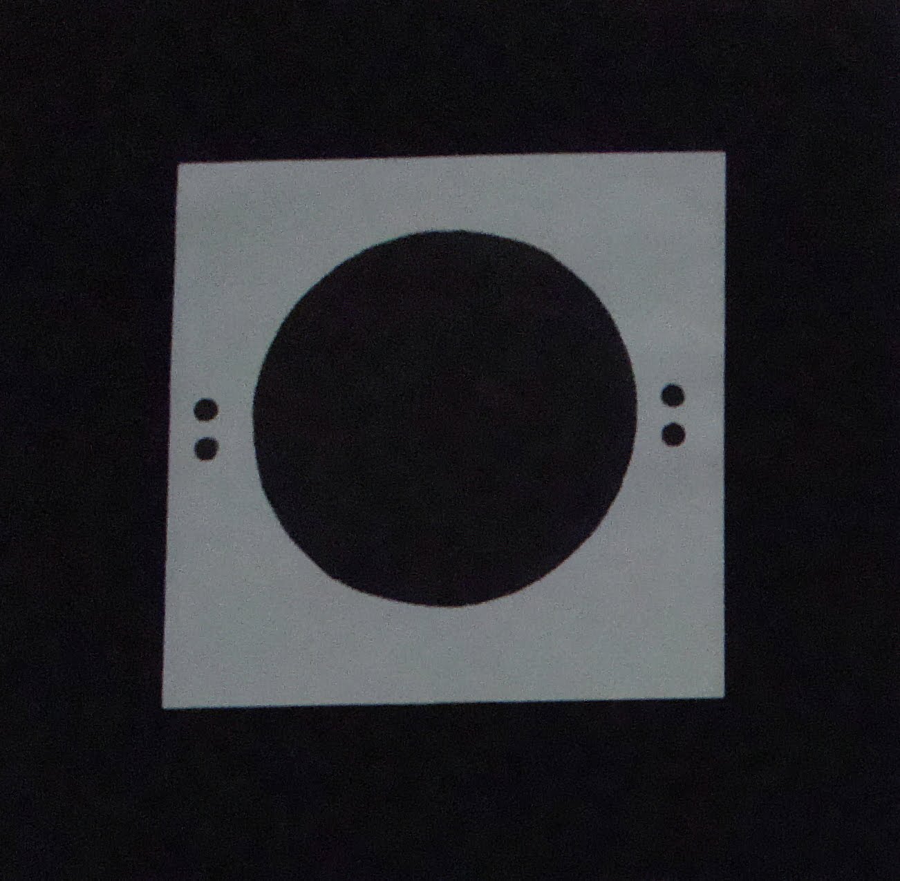
There are four aspects of gestalt:
1.Closure – understand the form as a whole
2.Proximity – distance between the parts that make up a form
3.Continuance – part of form overlaps itself or an adjacent form
4.Similarity – elements similar in size seem to be related
Depth and Perspective:
Depth creates contrast and creates purpose and meaning. A 3-dimensional figure contains depth and a 2-dimensional figure contains an illusion of depth created through visual representations.
Perspective is created through the use of lines to depict a 3-D form on a 2-D surface.
Visual Weight and Balance:
Visual weight is the sum of a form's components and is related to mass and energy. It is influenced by size and color. It may also be referred to as the degree of equilibrium in a composition.
Symmetry can create a stable form even after being divided diagonally, vertically, and horizontally.
Asymmetry creates an active form because when it is divided the resulting sides are not symmetrical. It creates a sense of movement.

Formal Matters
-Form is the set of visual elements such as line, scale, shape, size, composition, and color. It is also the means by which one gives substance to an idea.
Defining Form:
Formalist works are highly focused on their formal events because these create an aesthetic appearance. These are shape, color, and materiality. Modernism works are judged as a thing and are flat. Abstraction is nonrepresentational.
-Line – most basic mark, can be chaotic, thick, thin, fast, or slow.
-Color – emotional content
-Composition – arrangement of lines and shapes, make meaning out of a painting
-Fields – patterns across a picture plane
-Edges – Separate areas of color or shape
-Scale – work's size in relation to the world around it and relation of its parts
-Format – shape and proportions of a pictorial surface

Principles of Form and Design
What is Design?
A process of purposeful visual creation
Fills practical needs
Essence of “something”

Elements of Design
1.Conceptual elements
2.Visual elements
3.Relational elements
4.Practical elements
-Conceptual elements are not visible and are represented by point, line, plane, and volume.
-Visual elements are the most prominent parts of a design and are represented by shape, size, color, and texture.
-Relational elements govern the placement of shapes in a design and are represented by direction, position,      space, and gravity.
-Practical elements are the content and extension of a design and are represented by meaning, function, and representation.
Interrelationships of Forms:
When two circles put together eight different interrelationship forms.
Detachment – forms separated even though they are close together
Touching – move them close together and they touch
Overlapping – move circles closer and they overlap
Inter penetration – same as overlapping but seems transparent
Union – two forms joined together
Subtraction – invisible form crosses over visible form
Intersection – like interpenetration but the other form is visible
Coinciding – two circles become one


Form/Composition
Dot: can take any shape and is the visual expression of a point

Line: Connection of two or more dots, creates shapes, divides space, and can connote emotional qualities

Plane: Area outlined by lines

Volume: Product of dots, line and planes, is an illusion of a three-dimensional form on a two- dimensional surface

Characteristics of Form:
Size measures height and length
Shape is the external outline of a form
Texture is visual in a two-dimensional form and is the sum of visual components that create unified grouping
Color is value (light and dark)
Defining Composition:
Composition is the arrangement of elements within a defined area. It conveys a specific meaning and seeks harmony.
-Simplicity and Complexity:
Simplicity forms with a limited number of simple elements.
Complexity can reveal subtleties of an idea.
-Order of Chaos:
Chaos brings clarity, but the design involves orderly structures and intent.
-Proportions:
Size relationships between parts of a form.
Attention and Hierarchy:
Attention makes the components stand out before others. The dominant area is known as the focal point.
Hierarchy makes a composition more active and engaging.
Contrast:
Attention is created through contrast. Contrast refers to the differences among elements. It can create a focal point.
Rhythm:
Movement from one idea to another. It is the result of hierarchy, contrast, and structure. It requires timing and spacing and is the formation of patterns.
Structure:
Internal parts of a form that support and define its appearance. It holds the components together and creates a sense of continuity.

Artist Interview
Art comes from the unconscious or immutable. The creation of harmony is essential of art.

Wednesday, September 1, 2010

Natural Form Studies

9/1/10

The class was given two objects to study and examine. Everyone was given a piece of cardboard, and an object of nature.
I have discovered that the cardboard is hard to shape with your own hands, but can be cut and manipulated. I cant just trace a shape and cut it out with an exacto knife easily because the inside of cardboard is thin. We have to use cardboard to make a three-dimensional shape of the natural object.  It has to be at least two feet around or more.
The object I have to create with the cardboard is a sweetgum fruit. It comes off of trees, but I was lucky enough to get one that had just fallen because it is not dried out yet. I have found out that it falls apart very easily. The body of it falls apart by the touch and is very soft on the inside. It was completey whole when I got it, and the outside has a rough texture. After a couple of days it started falling apart and I discovered that the pieces that hold the gumball together are soft! They are a bit furry and there are quite a few of them.
I have decided to put my project together by cutting cirlces out of the cardboard and layering them on each side to make it look sphere like. I have been working on it in class and I have put something together. At first I was just cutting out circles free hand, but after gluing some of the pieces together I realized that I need to make perfect circles to give it more shape and make it look more organized.

Here are some pictures to share of the sweetgum, drawings, and possible solutions for the project.