My Blog List

Monday, October 18, 2010

Module Madness Critique


My module got critiqued today. Mark and Juston were in charge of critiquing it and they said they like how one half is angular and the other half is smooth because it shows the differences.
The board I used only had one coat of spray paint, which made it look more like the natural ground.
They didn't like the fact that one of my legs is facing the away from the viewer, and two of my shorter legs weren't bent together like the rest, and this bothered them a bit.
The legs to my piece work well with it because they are playful and are used from bottle caps as well.
Some people liked how I used the gold bottle caps in the center of the piece, but some said it would have been better if I spread them out more and did a little sections at a time.
If I could go back, I would fix the two little legs to make them look like the rest, or maybe just face the other  towards the viewer. I would also do one more section of gold caps on the middle loop to make it look more even.

Sunday, October 17, 2010

10 Mini Posters

Here are the 10 mini posters I chose with different solutions for the text.


Sunday, October 10, 2010

Images Made by Mark Making Device

Here are 20 images of the marks my mark making device made. I tried several different ways of using my device to make a variety of marks. I splattered, dragged, rolled, dripped, and even spun my device.


Mark Making Images

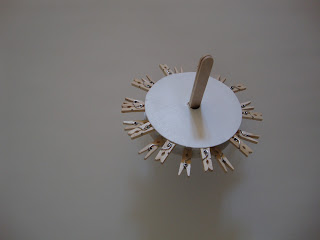
Here are a couple of photos of my device as it was being built.


This is my completed mark making device:


This is my mark making device in action:


Here are a few videos of the device in motion:


Final Quote

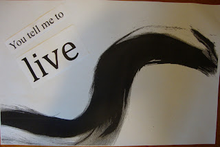
The final quote I am going to use is "You tell me to live." It was one of my favorite quotes out of my ten.

Thursday, October 7, 2010

Lecture Assignment

Artist: Barnett Newman
Abstract Expressionist Movement

Yellow Painting, 1949
 Line, color, and value are involved in the repetition. This piece of art is simple and doesn't use many elements. It sits on the spectrum of monotony and harmony because it doesn't really elaborate one thing- it is plain and simple. The repetition of the lines in this piece make me think of a page because it is marked off and you only want to look or work inside those lines. They also make me wonder if there would be another line the same distance apart if I was to extend this artwork.


Artist: Barnett Newman
Abstract Expressionist Movement

Dionysius, 1949
Line, color, and texture are involved in the repetition. This piece of art sits on the spectrum of monotony and harmony because the repetition is very clear and there is symmetry. It is also a simple piece of work that doesn't elaborate one specific thing. The repetition in this piece makes me think of depths of the ocean. Maybe it is the color blue and the thickness of the lines. The further down you go into the ocean, the calmer it gets. 


Artist: Philip Guston
Abstract Expressionist Movement

Ancient-Wall, 1976
The elements involved in the repetition are point, line, color, texture, shape, and value. This artwork has more variety, therefor it has more chaos. There are so many horseshoes that you don't know which one to look at and it is chaotic. You can't focus on one thing. The repetition used in this piece confuses me. I don't know how I am supposed to follow all the objects, but I'm thinking that the artist wanted to repeat the same things in different directions so that the viewer doesn't focus on only one thing. 
Artist: Philip Guston
Abstract Expressionist Movement

Zone, 1953-54
Line, color, texture, value, and space are used in the repetition. I would say this painting has more contrast and chaos than harmony because it is elaborating the red strikes. It is more complex and the viewer doesn't automatically know what message is being communicated. The repetition used in this piece makes me think of the red marks as a blood spatter or apuddle. It is messy and spaced out all over the place and doesn't look orderly at all.
Artist: Sol Lewitt
Minimalist

Color Arcs in Four Directions, 1999
Line, color, and shape are the elements involved in the repetition in this piece. It lays more on the spectrum of harmony because there is one simple pattern. There isn't much variety except for the colors. When I look at this piece I think of different parts of a large circle. I feel like if I look at it long enough it could hypnotize me. 

Artist: Sol Lewitt
Minimalist

Triangle, 1980
Line, shape, and texture are elements involved in the repetition. It lays more on the spectrum of monotony because it consists of lines and they are only running two directions. It is plain and simple. When I look at this piece it makes my eyes hurt! There are so many lines and the contrast of black and white play with my eyes. The triangle pointing down makes me move my attention downwards.
Artist: Frank Stella
Minimalist 

West Broadway, 1958

Line, shape, and color are the leading elements in this repetition. It lays on the spectrum of harmony because there isn't really a variety and it consists of lines and one shape. This piece of art makes me think of a flag. I think it's because of the lines and the plain rectangular box in the middle. The lines lead my eyes up this piece towards the black box at the top. 

Artist: Frank Stella
Minimalist

Your Lips Are Blue, 1958
Line, value, and color are the elements involved in the repetition. This artwork leans more on the spectrum of variety and chaos because the top half is just one color. Then I look at the middle and there are lines that are different shades and a different color than the top half of the painting and the bottom half has a lot of squiggly lines. The title of this piece confuses me because I do not see a reference to lips anywhere. I don't know what is going on but the lines in the middle lead my attention to the squiggly lines at the bottom. 

Artist: Bruce Nauman
Post-Minimalist

Green Light Corridor, 1970
Line, color, value and texture are the elements involved in this repetition. It leans on the side of monotony because there is one color being used, the walls are flat, and it is simple. This artwork makes me want to walk through the "corridor." I want to know how long it really is because from this view it looks extremely long. I think it has this effect on me because of the repetition of the color, the plain wall, and the texture and pattern on the top of the piece.

Artist: Bruce Nauman
Post-Minimalist

Lighted Performance Box, 1969
Line, color, texture, and value play a role in the repetition of this object. This box leans on the side of monotony and harmony because it is smooth all the way around and it is one simple shape. It has one specific function- it displays light from the top. When I look at this figure, the repetition of the same texture and shape makes me want to look at all the sides just to make sure it is exactly the same on the backside. I also want to feel it to see if it is smooth. 

Artist: James Turrell
Post-Minimalist

Lunette, 1974
Line, color, and value are the elements involved in the repetition in this piece. This artwork leans more on the spectrum of monotony and harmony because there isn't any chaos and I can focus on what is in front of me without any confusion. There is good symmetry and the pattern is obvious. The repetition makes this look like a hallway with doors, and it makes the ceiling look like it has a sun roof. The two white lights move my eyes towards the white light in the middle of the piece.
Artist: James Turrell
Post-Minimalist

Afrum I (White), 1967
Shape and line are the leading elements in the repetition. There isn't any contrast going on, so this artwork sits on the spectrum of monotony. There is great balance and symmetry. The repetition of the white shapes makes this piece of art look like a box or a rectangle. With this one I want to inspect it myself to see if the repetition continues around the whole piece. 

Artist: Elyce Abrams
Today

Winter I, 2009
Line, color, and value are the elements involved in the repetition. It seems like this artwork contrasts so I would say it sits on the spectrum of chaos and contrast. The use of light and dark colors and shades are obvious and they are what create the contrast. The repetition in this piece makes me read it from left to right like a book. The lines also look like trees in a blue forest.

Artist: Elyce Abrams
Today

Unshaded, 2007
Shape, color, space, and value are the elements involved in the repetition. This piece sits on the spectrum of contrast and chaos because there is asymmetry if you cut it down the middle and there is a lot of light and darkness. The repetition of the circle shapes makes my eyes move down the piece of art; like the circles are falling.

Artist: Alex Queral
Today

Linear Accumulation of Light V,2003
Line, contrast, and shape are the elements involved in the repetition. This piece of art sits more on the spectrum of monotony and harmony because there is a certain rhythm to the piece. It seems like all of the shapes are on the same level and not one of them really stands out from the other; they are all the same. The repetition of the lines, however, make me think that these shapes are coming outwards, like they are being shot out of something. The contrast of light and dark aids in this effect as well.

Artist: Alex Queral
Today

Particles in Motion I, 2004
Line, color, and shape are the elements involved in the repetition. This piece of art sits on the spectrum of monotony and harmony because they are all the same shapes, just different colors. The repetition is simple and they are all blending into one another. The repetition makes me dizzy. I don't know what to focus on and it seems like they keep building up even though they are just sitting there on the painting.